---
execute:
  eval: false
  echo: true
  warning: false
format:
  html:
    code-fold: false
---In [1]:
Importing the packages.
In [3]:
import numpy as np
import pandas as pd
import matplotlib.pyplot as plt
from sklearn.datasets import fetch_california_housing
from sklearn.model_selection import train_test_split
from sklearn.ensemble import RandomForestRegressor

import shap
import lime
import lime.lime_tabular
Loading the dataset with California houses’s prices.
In [5]:
data = fetch_california_housing()
X = pd.DataFrame(data.data, columns=data.feature_names)
y = data.target

X_train, X_test, y_train, y_test = train_test_split(X, y, test_size=0.2, random_state=42)
Training a Random Forest.
In [7]:
model = RandomForestRegressor(n_estimators=100, max_depth=12, random_state=42)
model.fit(X_train, y_train)
RandomForestRegressor(max_depth=12, random_state=42)In a Jupyter environment, please rerun this cell to show the HTML representation or trust the notebook.
On GitHub, the HTML representation is unable to render, please try loading this page with nbviewer.org.
RandomForestRegressor(max_depth=12, random_state=42)
Choosing a test sample for local explainability.
In [9]:
sample_idx = 0
instance = X_test.iloc[[sample_idx]]
print(instance.T)
print(f"True Target Value: {y_test[sample_idx]:.4f}")
print(f"Model Prediction: {model.predict(instance)[0]:.4f}")
20046
MedInc 1.681200
HouseAge 25.000000
AveRooms 4.192201
AveBedrms 1.022284
Population 1392.000000
AveOccup 3.877437
Latitude 36.060000
Longitude -119.010000
True Target Value: 0.4770
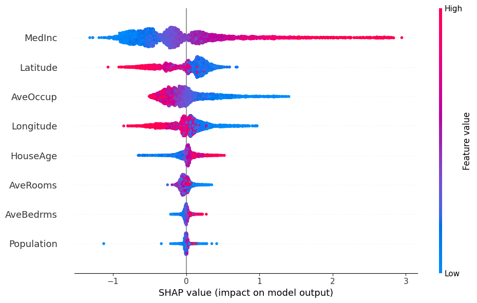
Model Prediction: 0.5416Calculating the SHAP values and plotting the local and global importance of the features.
In [11]:
explainer_shap = shap.TreeExplainer(model)
shap_values = explainer_shap(X_test)

plt.figure(figsize=(10, 6))
shap.plots.waterfall(shap_values[sample_idx], show=False)
plt.gcf().set_size_inches(10, 5)
plt.tight_layout()
plt.show()

plt.figure(figsize=(10, 6))
shap.plots.beeswarm(shap_values, show=False)
plt.gcf().set_size_inches(10, 6)
plt.tight_layout()
plt.show()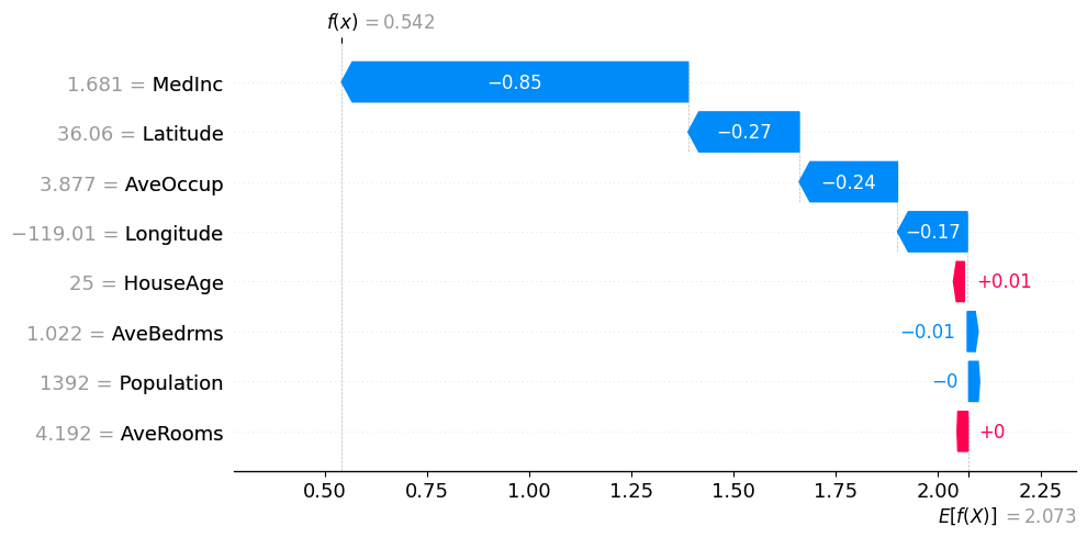
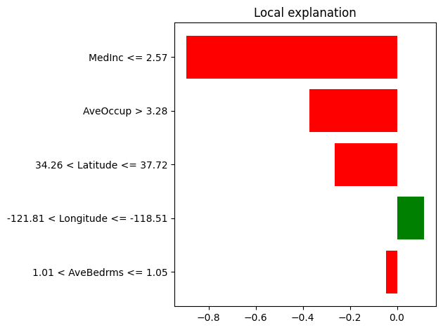
Doing the same for LIME values, plotting the local importance of the features.
In [13]:
explainer_lime = lime.lime_tabular.LimeTabularExplainer(
    training_data=np.array(X_train),
    feature_names=X_train.columns,
    class_names=['MedHouseValue'],
    mode='regression',
    random_state=42
)

exp = explainer_lime.explain_instance(
    data_row=X_test.iloc[sample_idx],
    predict_fn=model.predict,
    num_features=5
)

plt.figure(figsize=(10, 5))
exp.as_pyplot_figure()
plt.tight_layout()
plt.show()