---
execute:
  eval: false
  echo: true
  warning: false
format:
  html:
    code-fold: false
---In [1]:
Importing the libraries for an EBM.
In [26]:
import pandas as pd
import matplotlib.pyplot as plt
from sklearn.datasets import load_breast_cancer
from sklearn.model_selection import train_test_split
from interpret.glassbox import ExplainableBoostingClassifier
Loading a dataset.
In [22]:
data = load_breast_cancer()
X = pd.DataFrame(data.data, columns=data.feature_names)
y = data.target

X_train, X_test, y_train, y_test = train_test_split(X, y, test_size=0.2, random_state=42)
Creating and fitting the model.
In [24]:
ebm = ExplainableBoostingClassifier(
    interactions=0,
    outer_bags=1,
    max_bins=64,
    max_rounds=1000,
    learning_rate=0.05,
    n_jobs=-1,
    random_state=42
)
ebm.fit(X_train, y_train)
ExplainableBoostingClassifier(interactions=0, learning_rate=0.05, max_bins=64,
max_rounds=1000, n_jobs=-1, outer_bags=1)In a Jupyter environment, please rerun this cell to show the HTML representation or trust the notebook. On GitHub, the HTML representation is unable to render, please try loading this page with nbviewer.org.
ExplainableBoostingClassifier(interactions=0, learning_rate=0.05, max_bins=64,
max_rounds=1000, n_jobs=-1, outer_bags=1)Plotting the contribution of the feature mean radius.
In [30]:
feature_name = 'mean radius'
feature_idx = X.columns.get_loc(feature_name)

ebm_global = ebm.explain_global()
feature_data = ebm_global.data(feature_idx)

x_vals = feature_data['names']
y_vals = feature_data['scores']

plt.figure(figsize=(8, 5))

if len(x_vals) == len(y_vals) + 1:
    plt.step(x_vals[:-1], y_vals, where='post', color='blue', linewidth=2)
else:
    plt.plot(x_vals, y_vals, color='blue', linewidth=2)

if 'upper_bounds' in feature_data and 'lower_bounds' in feature_data:
    upper = feature_data['upper_bounds']
    lower = feature_data['lower_bounds']
    if len(x_vals) == len(upper) + 1:
        plt.fill_between(x_vals[:-1], lower, upper, alpha=0.2, color='blue', step='post')

plt.xlabel(feature_name)
plt.ylabel("Contribution")
plt.axhline(0, color='red', linestyle='--', alpha=0.5)
plt.grid(True, linestyle='--', alpha=0.7)
plt.show()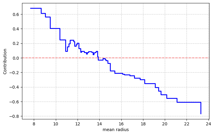
As depicted in the plot, lower values of the feature lead to higher probability of a benign tumor, while higher values increase the probability of malign tumors.